1. A SALE sign creates a sense of urgency, attracting more customers
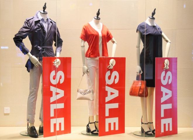
Does a big red sale sign really promise a good deal? Stores are actually using basic psychology in using the color that we react to most. In the human mind, red is associated with a cue for danger, thus creating a sense of urgency, causing customers to make a purchase. Red is also the color of sudden passion, again increasing the sense of urgency-to-pleasure customers feel.
2. Clothes and accessories are shown in sets and groupings
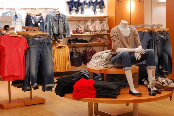
For stores, it is important to them to show you how you can style their products. After all, if a customer likes an item, there is a good chance that they will buy another if it matches or compliments it. This is known as cross-selling. Sellers pay attention to fabrics, patterns, and styles. So if they see a nice pair of pants, they will likely want a nice jacket or shirt to complete the outfit.
3. They place furniture in a way to slow you down
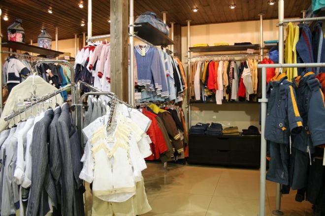
Stores want you to spend as much time as possible inside, so they will use small tricks to slow their customers down. To do this, they arrange tables, hangers, and racks so your walking pattern becomes curved. This will make you walk slower and will allow you to find more items to buy.
4. They suggest you add on items
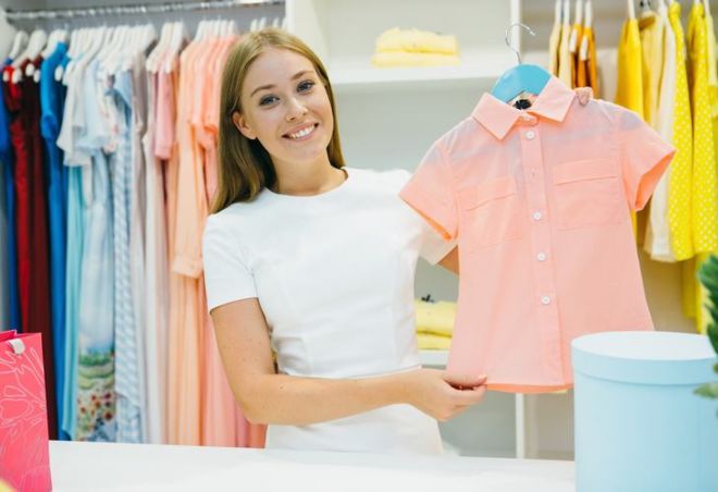
On your way to the fitting room, a retail associate is likely to suggest you try a basic shirt or an accessory on with your chosen items. They say it will help you see your item with something similar you have at home. But, their real intention is to make you add this suggested item to your purchase. This technique is known as 'suggestive selling'.
5. Sale items are placed close to the dressing room
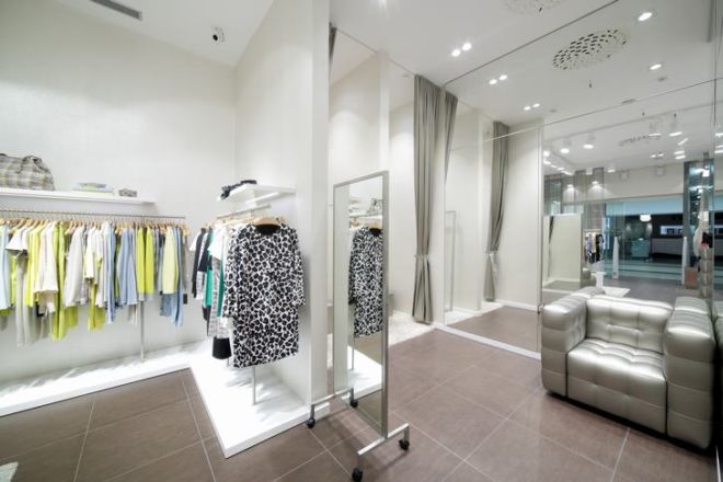
Many stores place their sale items at the beginning of the store, enticing walk-ins to go through the sale items first, choosing the ones they like, then heading to the fitting room, where they face another clearance section. This is done this way so that customers will be trapped by the discounts and will most likely add more to their purchase.
6. Clothes are made to be slightly out of season
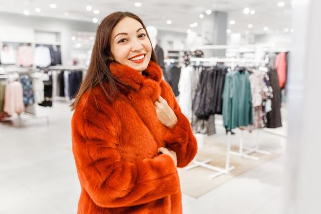
Clothing stores change their collections quickly. They keep adding new items representing the 'current' fashions almost every week. The fabrics used are mostly cheap which means that the items are likely to fall apart quickly. Doing so will make your customers feel like they are outside of the modern trends, and may make them feel like they are dressed-out-season - a feeling that is unpleasant for many people.
7. They use alluring scents and well-selected music to boost customers' mood
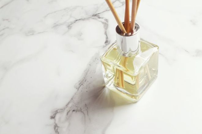
Have you ever wondered why all of a sudden you feel upbeat when entering a clothing store? Retailers choose the brightest colors, floral scents, and music that is carefully selected to remind customers of happy times in their lives, encouraging them to buy. Using the right aroma will also create a perfect ambiance for the customer and connects them, on an emotional level, with the brand. Research has shown that the right music makes customers stay in the store for a longer period of time and encourages them to spend more.
8. They use a hug-shaped design
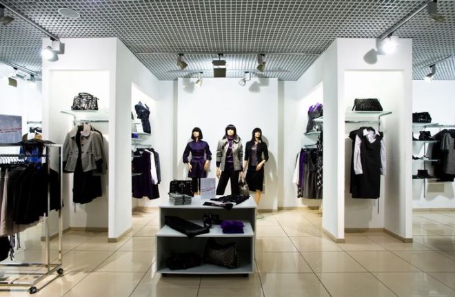
Retailers are well aware that people are attracted to round and U-shapes, so they are always ready to give you a so-called 'hug'. They design their stores to look round, arrange U-shaped backgrounds which subconsciously resemble a person opening their arms to give them a hug, inviting people to enter the space.